Tuesday, March 31, 2009

Marc Jacobs fall2008 RTW*


"We're ready, we're ready to start the show." That was Marc Jacobs himself, addressing the audience from the stage (stage, not runway) at 7:11 p.m. At 7:17, as Kevin Federline was still taking his seat in one of the makeshift, nightclub-style VIP booths not far from Selma Blair, Gretchen Mol, and Helena Christensen, Sonic Youth struck the first dissonant chord of "Jams Run Free," and Jacobs' first model walked out past the band. She wore a shawl-collar pouch-back coat in a shade that looked like camel, although we can't say for sure, concert lighting not being the best kind to illuminate such details. (One thing was immediately clear—whether he shows on a Friday or a Monday, it's always going to be an event.)The day switch and that revolutionary mere-17-minutes-behind-schedule start time weren't the only changes since last season. If Spring was all about sex, overt sex specifically, this show—his old friend Kim Gordon's gyrations notwithstanding—had a willfully sedate quality.Afterward, when asked about his inspirations, Jacobs replied, "I really wasn't very inspired this season. I just live my life." OK. When pressed, he offered a few more words: "Calm. Glamour. Casual. Beautiful women." Vague as that sounds, it was in fact an apt description for a collection that hinted at the eighties of Jacobs' early days in New York. It was there in the puffy headbands the models wore around their foreheads and the clubby atmosphere inside the Armory (some said it gave them Regine's, though the set's menacing scaffolding and the unsettling black-and-white images that played on a screen behind the band also suggested a more downtown environment). And it was there in the palette of soft pastels and grays and the relaxed (in terms of shape, not sensibility), somewhat masculine cut of the classic clothes.Jacobs showed plain-front button-downs with straight skirts; almost preppy popcorn-knit sweaters with narrow shorts; a cashmere sweater that spelled out HARDCORE paired with baggy leather pants; and a thigh-length bomber over a full, shin-grazing skirt. But his big focus was jackets and coats, many of which came with vertical folds of fabric gathered in the back above wide, hip-slung sashes. Dresses, too, came with pronounced volumes at the back. For evening, their stiff folds were replaced by gold or silver lamé pantsuits (paging Loulou de la Falaise) and drippy bias-cut velvet gowns.Was this collection, in its relative tameness and intriguing air of sexless safety, a rebuff of sorts to last season's detractors, who reprimanded Jacobs as much for his off-the-wall collection as for his perennial lateness? Could be. These clothes are challenging for different reasons than were the difficult transparent pieces he featured for Spring, but they'll be no less coveted. As for the show's accessories, women everywhere will have Jacobs to thank when other designers follow his lead and start producing a lower heel. That's the power of Jacobs' mystique.

for this collection,
soft hues are used ,
grey,white,orange,blue

Triadic Color Scheme is used ,


Monday, March 30, 2009

Marc Jacobs fall2009 RTW*


Marc Jacobs fall2009 RTW*


Leave it to Marc Jacobs to deliver a neon-hued, big-shouldered, crimpy-haired eighties antidote to the gloom and doom of 2009. "I was thinking about the good old days in New York," he said after the show, "when getting dressed up was such a joy." By the good old days, Jacobs means the nights he spent at clubs like Area, the Palladium, and Paradise Garage. Maybe it was the recent Stephen Sprouse project he completed at Louis Vuitton, or perhaps it's the fact that he now lives in Paris full time, but his Fall show was a big, juicy nostalgic kiss to a city that doesn't really exist anymore.The show started simply enough, with a gray cardigan sweater and charcoal trousers, but when the model walked past, you saw the back half of a kilt and braces—Jacobs' new uniform—and knew it was going to get personal. He worked his way through little silver-and-black A-line shifts; party dresses in metallic leathers and floral brocades with flaring, full skirts and monster shoulders; velvet bustier tops and high-waisted over-dyed jeans; and Crayola-bright jackets, capes, and hooded coats.


The only filter that separated these clothes from their East Village forebears was the expensive, luxury fabrics they came in. Every girl had a different hairdo, shellacked into Mohawks, flips, and bouffants, and the makeup was straight off the album cover of Duran Duran's Rio. The cumulative effect of all that color, volume, and optimism? One editor called it "A Flock of Seagulls meets Alexis Carrington."Will fashion as outrageously ebullient as this—in some cases, make that just plain outrageous—sell in the harsh reality of the late aughts? (And talking about harsh: More than 1,000 people were nixed from the invitation list this season in a cost-cutting slash and burn.) Jacobs insists that he wasn't thinking about the economy when he was working on the collection, and maybe he wasn't. These days, wagering that women will splash out on feel-good clothes is as good a bet as any.


as we can seethe collection , it use different colour scheme to perform his MJcollection ,
like, complementary, trid, etc,
on the fashion show, at the beginning , it firstly shows the grey, sliver , black whick is dark colour of his collection , and then , bright hues are spotlighted on the show !! and finally , the colour changed to dark again to show the show is finish :]

it just like our life with different period with ups and downs,
colour make our life with hopes but should not be sad :]

***
**
*

Sunday, March 29, 2009

Friday, March 27, 2009

Marc Jacobs spring2009*


for Marc Jacobs spring/summer 2009* collection,
the main hues are blue,yellow,red, white
and the accent hues are green ,purple


as we can see on the details of this collection,
different materials are used on,
like different pattern , checks, snake,etc..
surprisingly, it does not give a "too much"feeling .


for the collection,
it is using the
Triadic Color Scheme
This scheme uses the colors at 120º around the color wheel (360º).

Monday, March 23, 2009

about Marc Jacobs*

Marc Jacobs

He is arguably the most influential fashion designer in the world—and definitely one of the most talked about. Marc Jacobs has a flair for drawing attention, whether the headlines are about the endlessly analyzed looks on his runway, his buff new gym body, or the ups and downs of his personal life.Jacobs is, as many of these fashion chroniclers have noted, a bellwether, pointing audiences and buyers toward trends to come.

A chameleon and a quick-change artist, he often mines a particular theme or style—mod, volume, layers, to name a few—only to discard it entirely the next season, just as the rest of the world is getting on board the train. According to Women's Wear Daily, he is one of the few designers "who can in successive seasons present collections that are diametrically opposed to one another yet look signature."The Marc Jacobs stamp is that of unstudied cool, always with antiauthoritarian or outsider undertones—the irony is that between the various lines he produces under his own label and his work at Louis Vuitton, he is about as much of an insider authority as one man could be. Whatever his latest craze, the look is going to be pretty but not too polished, feminine but not too provocative, hip but never trying too hard. Having much-gossiped-about stars (from Lil' Kim to Victoria Beckham to his friend and muse Sofia Coppola) crowded into his front rows only keeps the headlines rolling off the presses.A graduate of Parsons, the New York City native launched his line alongside his current business partner, Robert Duffy, in 1986 with the backing of a Japanese company. In 1989, Jacobs was appointed the creative director of Perry Ellis, but was notoriously fired in 1992 after presenting his then-reviled Grunge collection (now, naturally, hailed as a seminal nineties moment). Emerging as an indie darling over the next few years, Jacobs accepted the position of creative director at Louis Vuitton in 1997, in part to finance the Marc Jacobs business, which LVMH subsequently bought. Today, Marc Jacobs is a global brand that also produces menswear, accessories, childrenswear, home furnishings, jewelry, watches, and fragrances…and the Man of Contradictions has taken home seven major awards from the CFDA.
*****

about Marc Jacobs


different poeple has different point of view about Marc Jacobs ,
overall, Marco Jacobs gives a new views of fashion design and it always gie us surprise on the following season.
NEVER INSIPID


Friday, March 20, 2009

Marc Jacobs spring 2000*


for the spring 2003 mj*

it is using the Balance of color
Variety of hue, light and dark values, and bright and dull intensities all help to balance color schemes.
it can echance the drark /light colour in order to make difference in the collection .
***
**
*

Thursday, March 19, 2009

Marc Jacobs spring 2003rtw


Hard and soft, past and present, good girl and bad girl—Marc Jacobs loves to play with opposites.
For Spring, he worked all those elements together into a collection that was sweet but with a hint of a hard edge—like a debutante who knows the bartender's name, or like Exene Cervenka, the lead singer of L.A. punk band X, whose songs made up the bulk of the night's soundtrack.
Part of the season's interesting dichotomy came from the silhouette:

Jacobs cut a more frankly feminine shape than he has in the recent past, with deep necklines on full-skirted dresses, body-hugging sheaths under boxy jackets, and snug pencil skirts or cigarette pants paired with sexy camisole tops. And part of it was his flower-garden color choices: soft pink, lavender, pale yellow, orange, chartreuse, and ivory. For even greater contrast, he manipulated soft, airy fabrics like satin, lace, and cashmere against dense ribbed ottoman, nubby, Chanel-evoking tweeds, and silk shantung.Jacobs brings in retro references both obliquely and directly; this season, he picked up bits from the cocktail-shaker days of the fifties and sixties: tiny bows and rolled collars, woozy polka-dot prints, "cocktail" dresses made from lace and satin. But despite its knowing dalliance with the past, this was a collection rooted very firmly in the here and now.
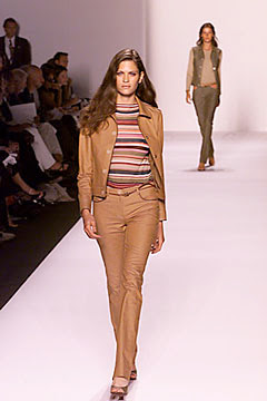
as we can see the spring 03 RTW collection , the colour used are not too sharp and it gives a soft feeling .and 80's LOOK (?)
MJ love to use colour with two parts, just like the balance ,
***
**
*

Wednesday, March 18, 2009

Marc Jacobs fall2009 RTW

fall 2009 rtw
*0*

THE MAIN COLOUR OF THE FALL 2009 RTW is
black ,grey,white,shiny yellow,
it uses many cutting to emphasis the bodice.
:]

Sunday, March 15, 2009

EXERCISE *

this is my fashion boutique by applying colour theories and principles :]
just like the collection , i use the evening mood again plus some wooden tables .
it can add some traditional chinese feeling on it .

by applying Split Complimentary Color Scheme
Similar to complimentary but chooses the adjacent colors 30º each way of the compliment.

***
**
*


exercise *


this is my collection :]
the colour i choose is 「evening colour」.
the colour are blue,orange,yellow, white,black
this can give a Harmony of color .


Saturday, March 14, 2009

Exercise on CHECK *


The burberry pattern is using
Monochromatic Color Scheme .This scheme uses the same color (hue) but changes the brightness and saturation to achieve different shades and tints.


This check pattern is using Analogic Color Scheme .
This scheme uses 3 adjacent colors. The base color plus two colors 30º either side. The distance (degrees can be adjusted for different effects)

Those that are adjacent to each other on the color wheel. They create harmonious combinations because they are relatives and have little contrast. Ex: Blues and greens.
***
**
*

Thursday, March 12, 2009

culture colour *

for today lesson, i learn about the culture colour .
it is quite funny to hear that different countries have different view on colour.

i do some research about chinese culture colour :]

Color in Chinese culture refers to the various colors that are considered auspicious (吉利) or inauspicious (不利).


Red

Contemporary red envelopes
A red envelope is a monetary gift which is given in Chinese society during holiday or special occasions. The red color of the packet symbolizes good luck.
Red is strictly forbidden at
funerals as it is a traditionally symbolic color of happiness.

Yellow/Gold
Yellow is also seen as a good luck color, as it is sometimes paired with red in place of gold, for obvious reasons. Yellow was also the color of the robes and attire of the emperors. However, yellow is also used as a mourning color for Chinese Buddhists, especially deceased monks.

Green
Generally green is associated with "health prosperity, and harmony" but green hats are associated with infidelity and is also an idiom for a cuckold.This has caused uneasiness for Chinese Catholic bishops, who in ecclesiastical heraldry would normally have a green hat above their arms. Chinese bishops have since compromised by using a violet hat for their coat of arms.

White/Silver
Unlike the Western meanings of purity, chastity, holiness and cleanliness, white is associated with death and is used predominantly in funerals in Chinese culture. Sometimes silver takes its place, as silver is often offered to the deceased in the form of
joss paper.

Black
Black is a neutral color used in daily clothing but is also used during a funeral to symbolize mourning, possibly adopted from Western practices. A black ribbon is usually hung over the deceased's picture.

Blue or Dark Blue
Blue or Dark blue is also a color for sombre occasions like funerals and deaths.

Ref,
***
**
*

Saturday, March 7, 2009

colour wheel


A color wheel or color circle is an organization of color hues around a circle, showing relationships between colors considered to be primary colors, secondary colors, complementary colors, etc.


rtists typically use red, yellow, and blue primaries (RYB color model), so these are arranged at three equally-spaced points around their color wheel.Printers and others who use modern subtractive color methods and terminology use magenta, yellow, and cyan as subtractive primaries.


Color scientists and psychologists often use additive primaries, such as red, green, and blue, and often refer to their arrangement around a circle as a color circle, as opposed to a color wheel.
The arrangement of colors around the color circle is often considered to be in correspondence with the wavelengths of light, as opposed to hues, in accord with the original color circle of Isaac Newton. Modern color circles include the purples, however, between red and violet.
Intermediate and interior points of color wheels and circles represent color mixtures. In a paint or subtractive color wheel, the center is usually (but not always) black, representing all colors of light being absorbed; in a color circle, on the other hand, the center is white or gray, indicating a mixture of different wavelengths of light (all wavelengths, or two complementary colors, for example).


Some sources use the terms color wheel and color circle interchangeably, though the one term or the other may be more prevalent in certain fields or certain versions as mentioned above. Some reserve the term color wheel for mechanical rotating devices, such as color tops or filter wheels. Others classify various color wheels as color disc, color chart, and color scale varieties.

****
***
**

*

Marc Jacobs 07F/W *


**********************


When the red velvet curtain finally opened, Marc Jacobs' 56 models were arrayed tableau vivant-style in front of an enormous set of French doors—the kind you might see in a Paris salon. What you noticed first were the hats. Multicolored, with knit crowns, and short or wide brims, they made the gangly teenage girls onstage hold themselves like proper ladies. Yes, fashion's favorite change agent was at it again.Last season's billowy layers were nowhere in sight. The collection began with a long coat, ribbed sweater, and trousers with loose stirrups that gave them a clean, sharp line. Moving on, Jacobs showed printed satin and matte jersey shirtdresses to the mid-calf, and belted alpaca tunics over slim cropped pants and knee-length skirts. There were jumpsuits straight out of the seventies.

"I wanted something narrower," said the designer, describing the show's new silhouette. Duchesse satin minidresses were cut trim and A-line with a fringe of pleats at the hem, or they came draped, wrapped, and sashed from the shoulders.This was American sportswear, but with a European sense of impeccability. Some might call it "grown-up." Jacobs, explaining that the collection is a reflection of what's going on with him personally, called it restraint. (Though the term can hardly be used to describe the show's stacks of plastic bangles and Bakelite-heavy handbags.)

One look at the designer and you're reminded that he's been spending time at the gym—those were pecs beneath his crisp blue shirt. The experiments with volume that he's been focused on in the last several collections have now gone the way of his extra weight. It might take a season for designers who've followed his lead before to catch on. But less, when it looks this chic, really is more.


***
**
*

the colour that this collection used ,
mainly
black ,white ,deep blue, yellow, deep orange
it likes the evening mood :]